Write to us:
There was a time when software didn’t try to be beautiful. It didn’t try to be calm. It didn’t try to convert you. And somehow, it felt more alive.
Before design systems, before UX best practices, before every app started looking like the same slightly rounded rectangle software was allowed to be ugly. Loud. Confusing. Overdesigned. And deeply personal.
This was the era of Winamp skins, early Windows interfaces, and Flash websites that took 30 seconds to load just to show you a spinning logo and a soundtrack you didn’t ask for. Think back to the dial-up days of the late 90s and early 2000s, when your 56k modem screeched like a possessed robot, and the web felt like a wild frontier. No Material Design guidelines. No Figma handoffs. Just pure, unfiltered creativity from bedroom coders and garage designers channeling the chaotic spirit of MTV’s glitchy bumpers and nu-metal album art.
And we loved it.
Ugly Software Didn’t Mean Bad, It Meant Free
“Ugly” software wasn’t careless. It was uncontrolled.
No one was optimizing for retention curves or onboarding funnels. No one was A/B testing button colors. Most people building software were just… experimenting. Trying things. Seeing what happens. In the pre Web 2.0 wild west, developers hacked together UIs on a whim, inspired by everything from comic books to cyberpunk zines. Tools like Borland Delphi or early HTML editors let anyone slap together gradients and GIFs without a style guide in sight.
The result? Interfaces that broke rules before rules even existed.
- Bright gradients that screamed “Y2K futurism.”
- Fake 3D buttons with metallic bevels, mimicking the shiny plastic of a PlayStation controller.
- Fonts like Comic Sans or Wingdings that had no business being on a screen, yet they popped up everywhere.
- Animations that served no purpose except vibes, like bouncing icons that looped until you laughed or rage-closed the window.
Software wasn’t clean, it was expressive. It mirrored the era’s cultural mess: the baggy jeans and frosted tips of nu-metal kids, the over the top CGI in The Matrix (1999), or the pixelated chaos of early The Simpsons episodes flashing across your CRT monitor. Ugly software felt like a mixtape from a friend flawed, but full of soul.

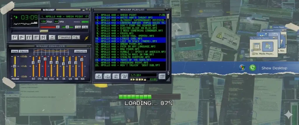
Winamp Skins: When Users Took Over the Interface
Winamp wasn’t just a music player. It was a canvas.
Launched in 1997 by Justin Frankel and Dmitry Boldirev, this lightweight MP3 player exploded during the Napster fueled piracy boom of the early 2000s. By 2000, it boasted over 50 million downloads, but its real magic was the skinning system introduced in version 2.0. Users didn’t simply install it, they customized it. And customization wasn’t subtle. You could turn your player into a chrome spaceship dashboard, a gothic nightmare, or something that looked like it belonged inside a 2001: A Space Odyssey set piece.
The Winamp skinning community went nuclear. Over 100,000 user submitted skins flooded the official website by 2003, ranging from minimalist wireframes to psychedelic fever dreams. Many were objectively terrible:
- Unreadable text crammed into pixelated fonts.
- Buttons hidden in abstract shapes, like a slider disguised as a melting clock.
- Visual chaos everywhere think lava lamp backgrounds clashing with skull motifs ripped from MTV’s Headbangers Ball.
But they were yours. Download a skin pack, unzip it into the Winamp folder, restart, and boom, your desktop music machine became a personality statement. It trusted people with aesthetic freedom, something modern software almost never does. Today, personalization means switching between Light and Dark Mode (or maybe a cheeky color accent in apps like Spotify). Back then, it meant turning your player into a cyberpunk shrine while blasting Linkin Park’s Hybrid Theory.
Winamp’s legacy lives on in underground revivals. Projects like RetroArch emulate that skinning spirit for emulators, letting gamers wrap their N64 ROMs in Tamagotchi inspired shells. In an age of subscription locked themes, Winamp reminds us: true ownership meant getting messy.
Early Windows Wasn’t Minimal, It Was Honest
Look at Windows 95, 98, or XP. These weren’t sleek dashboards, they were digital scrapbooks.
Buttons looked like buttons puffy, embossed slabs with drop shadows that made them pop like real-world push-buttons. Windows looked like windows, complete with thick borders, title bars in electric blue (or apple green for 98), and minimize/maximize glyphs that mimicked physical hardware. Everything had shadows, borders, bevels, and weight. Launch the Start menu in Windows 98, and it unfolded like a pop-up book, with animated dogs (yes, the infamous barking pup) wagging tails in the tray.
It wasn’t elegant, but it was self explanatory. Modern interfaces often hide functionality behind abstraction—swipe gestures, hamburger menus, infinite scrolls. Early Windows did the opposite: it overexplained. It wanted you to understand what you were clicking, dragging, minimizing. Hover over an icon, and it lit up with a 3D extrusion. Right-click anywhere, and a context menu erupted like confetti.
Yes, it was visually noisy. The XP Luna theme alone packed more chrome than a lowrider car show. But it was also welcoming. It didn’t assume you were a product manager or a designer. It assumed you were human, maybe a teen in Eastern Europe blasting pirated demos on a second-hand PC, discovering the internet one clunky dialog box at a time.
Hidden gems amplified the charm. Windows 98‘s “Hover!” game let you chase a flying toaster screensaver. XP’s pinball had fisheye physics that felt alive. These Easter eggs injected personality into the OS, turning “ugly” into endearing. Compare that to Windows 11‘s flattened Fluent Design efficient, sure, but about as soulful as airport lounge muzak.


Flash Websites: Useless, Slow, and Unforgettable
Flash websites were terrible by today’s standards. They loaded forever on dial-up (we’re talking 5-10 minutes for a full site). They ignored usability. They often trapped you inside an experience with no clear navigation, no back button respect, just endless preloader bars synced to thumping electronica.
And yet, they mattered.
Flash, launched by Macromedia in 1996, turned websites into experiences, not tools. Designers treated the browser like a stage, not a dashboard. Music played on loop (often unlicensed Eurodance tracks). Animations told stories. Interactions surprised you, drag a logo to unlock a hidden menu, or mouse over a character that danced and quipped back.
Iconic examples? BMW Films’ 2001 series, directed by Ang Lee and the Wachowskis, turned car ads into short films with interactive chases. Or the surreal Petit Planet (2000), a blob world that oozed around your cursor. Even corporate sites got wild: Coca-Cola’s 2002 holiday invasion featured invading Santas you could pelt with snowballs. No one cared about bounce rate. No one asked, “But what’s the CTA?”
Flash sites didn’t want you to convert. They wanted you to feel something, the thrill of discovery amid the glitches. When Adobe killed Flash in 2020, we didn’t just lose a technology; we lost a mindset. The web traded spectacle for speed, but echoes survive in WebGL experiments and indie sites like Neal.fun’s absurd interactives.
Before UX Best Practices, There Was Personality
Modern UX is efficient. It’s tested. It’s safe. Follow Nielsen’s heuristics, and you’re golden flat cards, ample whitespace, 300ms tap targets.
And it’s painfully similar everywhere. Scroll TikTok, Notion, or your bank’s app, it’s the same sans-serif blur.
The early software era had no best practices, only instincts. Designers copied what they liked, not what converted better. Interfaces carried the fingerprints of the people who made them: a Geocities pagebuilder’s HTML tables nested five deep, or ICQ’s exploding hearts for “flirts.”
Some things were frustrating (Flash menus that broke on refresh). Some things were broken (Winamp crashes mid-skin swap). But they were memorable. Today, most apps are usable. Very few are unforgettable, like stumbling on a 2003 Flash cartoon that parodied The Simpsons with custom cursors.
The Price of Perfection
We gained a lot:
- Accessibility: Screen readers and high-contrast modes for all.
- Performance: Sub-second loads, no more modem purgatory.
- Consistency: Cross-device harmony that doesn’t fight your muscle memory.
- Ease of use: Intuitive flows that onboard anyone in seconds.
But we also lost:
- Visual risk: Bold experiments replaced by safe pastels.
- Emotional attachment: Apps as utilities, not extensions of self.
- Digital personality: One-size-fits-all themes over user canvases.
- The joy of discovery: Predictable UIs leave no room for “what’s that?!”
Software stopped being weird. And when something stops being weird, it usually stops being interesting. Data from SimilarWeb shows modern sites prioritize “frictionless” design, but engagement often dips without that spark ironic for an era obsessed with metrics.
Will Software Ever Be Ugly Again?
Probably not in the same way. The modern web is optimized, standardized, and monetized. Every pixel is justified. Every animation has a purpose. Every design choice is backed by data from Google Analytics or Hotjar heatmaps.
But maybe ugliness isn’t gone, maybe it’s just underground.
- Indie projects: Tools like Bitsy let creators build lo-fi games with deliberate “bad” art.
- Retro revivals: Steam’s pixel art boom and browser extensions mimicking Winamp.
- Creators who value expression: NFT artists and glitchcore devs on itch.io shun polish for raw edges.
Because sometimes, ugly software wasn’t ugly at all. It was human flawed, fervent, and full of life, like a scratched CD of your favorite 90s mixtape.
Glitchback is about remembering the moments when technology felt less perfect and more alive.

 7")